


Tips for Building an Eye-Catching, Cohesive Brand
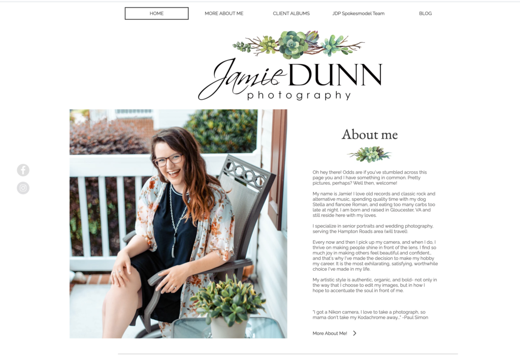
Want to see my website five years ago? I don’t, but I’ll show you because that’s how much I care. I had to go back in the ARCHIVES for this one. Feast your eyes on the baby beginning of my brand, Jamie Dunn Photography in 2017.
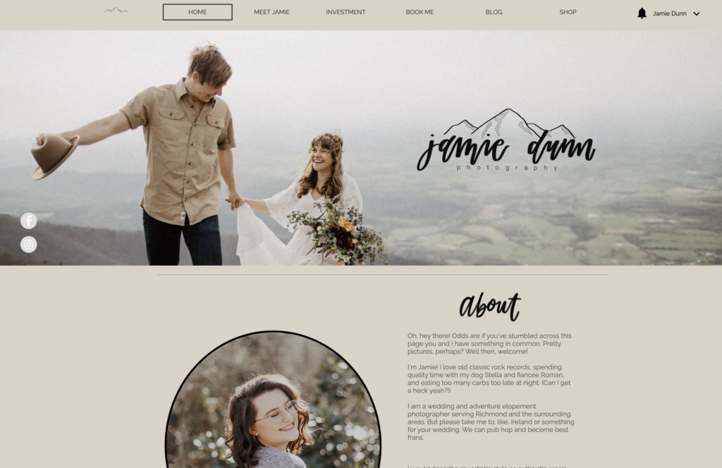
I did improve. But not much. Presenting Jamie Dunn Photography *rebranded* circa 2019.
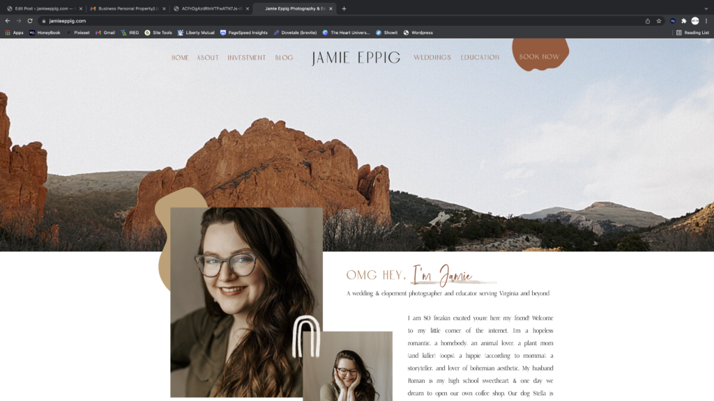
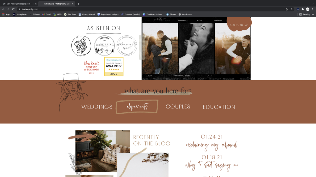
And just for my own peace-of-mind: behold Jamie Eppig Photo & Education, circa CURRENT!
Why did I just share with you one of the most embarrassing parts of my business past?
Well, because if you only started following me recently then you wouldn’t know the journey I took to get here. I didn’t just frolic over to the courthouse, business license application in hand, and suddenly gain all the knowledge on building and creating a brand (I think that’s clear now). In fact, not only was I completely clueless on how to build an aesthetically pleasing & cohesive brand, I don’t think I even realized it was a thing. Like at all. To be honest, when I started, I didn’t even have a website. I didn’t feel like I needed one because I had Instagram. So regardless of the phase you’re in in business right now, give yourself a pat on the back. And be gentle with yourself. We are so quick to compare ourselves to others, when in reality the only thing you should be comparing yourself to is your past self. We’ll call it reflecting.
I did go on a little tangent there, but I just think it’s so important to know that if what I’m saying is completely new or foreign to you, that’s okay! We’re here to learn. This is a safe space for creative business owners- I gotchu!
So how did we get here? *Cue Decode by Paramore* I made a few mindset adjustments and implemented a few design techniques that I really feel elevated my brand.
Picking A Color Scheme
First and foremost, pick a color scheme and STICK to it. If you’re a photographer, or really any creative entrepreneur, you probably love color schemes and color theory already. I chose my overall color scheme by examining my photography and combining some of my favorite colors to wear and decorate my house with. I love a good vibe, so those three color concepts are pretty cohesive in my life. My photography style is warm & earth tones, I wear lots of neutrals & burnt oranges, and my house is a combination of earthy greens, blacks, & soft whites.
Once I gained that clarity on the brand colors I’m drawn to, I went to Pinterest to find color schemes. There are so many palettes to choose from, and choosing one that is already curated is so much easier than trying to come up with an aesthetically pleasing color combo on your own. Here is what I came up with:

When creating a cohesive brand, especially when designing your website, it’s so important to use the same exact colors throughout. To make sure it’s precise, you can open a screenshot of the color in Photoshop and use the eyedropper tool to get the web color number. Use those numbers to plug your specific brand colors into your website. You can also use these specific shade numbers for customizing templates in Canva, Instagram Highlights, and so much more. I clearly did not do this in 2017.
Choosing Fonts
The next important aspect of a cohesive, eye-catching brand is font choice. You can find font combinations on Pinterest & Etsy as well- in fact, you can purchase them on Etsy for pretty cheap, and it tends to look much more professional to use custom fonts over the ones that come with the software. Make sure that your fonts are easy to read and stay consistent throughout the website- for example, use the same font for Header 1 everywhere- don’t switch it up randomly. Title fonts can be fancier and more intricate while paragraph fonts should be simple and easy to read.
Using A Template
Finally, if you don’t have a background in web design or branding, I encourage you to start with a template. Even if you change the fonts and colors completely, a good website template is already optimized for a smooth customer experience. Plus, it will include elements that you couldn’t come up with yourself without a background in building a website. A few great places to start include Tonic Site Shop, Davey & Krista, & The Heart University. All of these resources range in prices, so depending on your budget, you should be able to find something you love as at least a base! (Hint: your finished website should not ever look exactly like the template- they are created to be customized!!)
I hope you feel more prepared to create a gorgeous, cohesive brand! I’m always here for you if you need any help along the way, friend. Good luck!
March 22, 2022

